Column Graphs
A column graph is a graph with a horizontal axis (the x-axis), a vertical axis (the y-axis) and separated rectangular bars that indicate discrete data.
Of the two variables in bar graphs, the independent variable is the one on which the other variable depends. The independent variable goes on the horizontal axis and a common example is the months of the year. The dependent variable is written on the vertical axis and a common example includes the frequency.
Some important tips are:
- The numbers that are used on the axes should go up by 1s, 2s, 5s, 10s, 20s, 50s, 100s, 200s, 500s, 1000s and so on.
- Never use other numbers such as 3s, 4s, 6s, 7s, 8s and 9s.
- The axes do not have to start at zero.
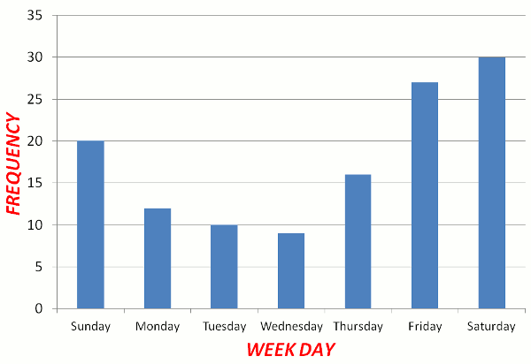
Example One - Number of Murders
The number of murders in one week in Honduras, Central America:
| WEEK DAY (INDEPENDENT VARIABLE) | NUMBER OF MURDERS (DEPENDENT VARIABLE) |
| Sunday | 20 |
| Monday | 12 |
| Tuesday | 10 |
| Wednesday | 9 |
| Thursday | 16 |
| Friday | 27 |
| Saturday | 30 |
Did You Know That...?
In 2010, Honduras in Central America had almost the highest rate of intentional homicide in the world. There were about 6240 murders. This is approximately 17 murders per day! Sadly, Southern Africa's murder rate was even higher.
Example Two - Best-Selling Musicians of All-Time
| NAME OF MUSICIAN (INDEPENDENT VARIABLE) | NUMBER OF ALBUM SALES (DEPENDENT VARIABLE) |
| Beatles | 600 million |
| Elvis Presley | 600 million |
| Michael Jackson | 350 million |
| Led Zeppelin | 250 million |
| Queen | 150 million |

Question - "Hotness" of Hot Peppers

| NAME OF PEPPER (INDEPENDENT VARIABLE) | HOTNESS (DEPENDENT VARIABLE) |
| Jalapeno | 3 500 |
| Peter pepper | 10 000 |
| Tabasco pepper | 30 000 |
| Bird's eye chilli | 50 000 |
| Habanero chilli | 100 000 |
The table above shows part of the Scoville Scale for the "hotness" of peppers (chillies). The units are Scoville Heat Units (SHU). Draw a column graph of this data. (Hint: Go up by 5000s on the vertical axis.)
Did You Know That...?
On the Scoville Scale, the pepper spray used by police is over 500 000 SHU.

| 
| 
|